I’ll be honest. That title was partly just to get your attention—but only partly. One of the teams I work with here at Amitech just launched our first-ever interactive quiz. It’s styled after the near-ubiquitous Buzzfeed-style quizzes that appeal to the curiosity inside each one of us about which wizarding house we fit into or whether we know more about pop-culture than the 95% of people who get this math question wrong, etc. But instead of telling you which Disney princess you are, our quiz gives you insight into where you fit into the important conversation surrounding social determinants of health. If you haven’t seen it yet, check it out here to find out how your own characteristics match up with broader patterns in social determinants of health across the country.
While our interactive infographic is a great way to pass the time between the other Buzzfeed quizzes you’re taking, I thought you might also be interested to know more about the sophisticated data science behind it and how that can be applied to understanding and solving some of healthcare’s biggest challenges.
Why Social Determinants of Health?
If you’ve been following the chatter in healthcare analytics for a while, you already know there are a lot of studies showing that your social circumstances have as much (or more) influence on your ultimate health outcomes as the treatment you receive. As an example, according to the Kaiser Family Foundation, social determinants of health account for more than 1/3 of all deaths in the US. Another study shows that the link is so strong, in fact, that a person’s zip code is now a better predictor of his or her overall health than nearly any other factor—including race and genetics.
Even though social determinants are all the buzz in healthcare circles, many people still don’t really know what it means. While there’s no single universal definition or common data source for this information, there is a consensus on the categories of things that comprise social determinants of health. The US Department of Health and Family Services has defined social determinants of health as the conditions of the environment in which people are born, live, learn, work, play, worship, and age that affect a wide range of health, functional and quality-of-life outcomes and risks. That is, it’s all of those things outside of your medical situation that impact your health. These aren’t things that healthcare providers are currently well-suited to measure or treat, but they have a huge impact on both individual and population health. This is why we wanted to build an interactive infographic that would help you see how your social determinants of health look in the context of an entire country.
Finding the Framework
As with any data science project, the first requirement is to have a source of data. With social determinants of health, that was particularly challenging. There’s no standard definition of what comprises these measures; there’s no common source for the data; and there’s no common interpretation. We had to work from the ground up to collect data that would be suitable for the specific analysis we wanted to do: identify what other regions of the country you are most like, based on your social determinants of health.
After substantial research, we landed on a framework provided by the US Centers for Disease Control (CDC) that identifies five categories of social determinants of health. Our primary reasons for running with this framework include:
- The categories are distinct and diverse
- It’s likely to be a manageable amount of data to work with
- It makes for some easy questions to ask a user through an interactive quiz
We settled on the five CDC categories of economic stability, education, social and community context, health and health care, and neighborhood and environment.
Nothing to Drink in an Ocean of Data
Unfortunately, finding sources of data for the five CDC categories wasn’t simple. We set out to look for what we thought would make for reliable classifications broadly across the nation and for precision that was tighter than state-level. We researched the CDC’s data, the Center for Medicare and Medicaid Services (CMS), the Census Bureau, the Bureau of Labor Statistics, dozens of major medical journals, and aggregators like Kaggle. (Google’s Dataset Search wasn’t available when we started the project, and it may have only been a minor help based on a preliminary search.)
Our process of narrowing down which data sources we could use required us to take an iterative approach to discovery across the five categories. First, we would find a great source in one category that met all of our needs. Then we’d find another in the second category that worked well but was only available at the ZIP code level rather than Metropolitan Statistical Area. We could map that data, but that would require significant additional computation. We’d find other great source, but it would be a decade away from the other sources, and we thought that incongruity could cause issues. Then we’d find another great source, but the kinds of information being used to measure the category weren’t questions that we could ask at the individual level (how many jobs have you applied for in the past month, for example) that would apply to enough of our audience.
Even after picking a data source, sometimes our distribution analysis and data profiling would lead us to ultimately reject that data. Some data, for instance, ended up being poorly distributed and not well suited for this kind of analysis. There are lots of things we’re highly polarized around, but things with a more normal distribution make for better models in many cases.
Quenching our Thirst without Getting Drunk on Data
In the end, we landed on a series of five questions that we could ask that lined up with the five categories of social determinants of health. We recognize this won’t have as strong a predictive power as a 20 or 50 question survey, but we wanted our participants answering questions for 30 seconds, not 30 minutes.
|
Neighborhood: |
Access to Parks |
|
Education: |
Education Level |
|
Food: |
Daily Servings of Fruits & Vegetables |
|
Community: |
Voting Activity |
|
Healthcare Access: |
Insurance Coverage |
Distilling Information from our Data
With useful data sources in hand, there was still a lot of work ahead of us to aggregate, integrate and normalize that data for use in our model. First off, several of our data sources were at different levels of geographic granularity. We had settled on the concept of Metropolitan Statistical Area (MSA) used by the US Census Bureau. But some of our other sources of data were captured at the county level, which then had to be mapped across to MSA using a custom crosswalk. In that aggregation, we had to determine what we would do with the data we had: take the mean or mode or median value? And should the components values be weighted based on population distribution, if we have that data available? With a common geographic specification in place, we could align all of our raw data along the common axis of MSA.
In one of the cases, we also needed to perform a kind of principle component analysis (PCA) to determine how several different survey questions all related to the same underlying question (Fruits and Vegetables) and influenced the results. The outcome of that PCA exercise gave us a way to combine several questions into one and create a composite attribute representing fruit and vegetable consumption.
Comparing Apples to Apples
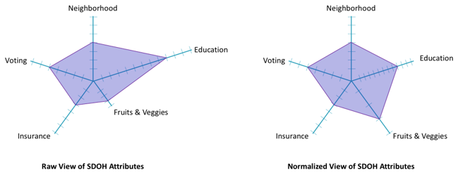
The next thing that we needed to do was normalize that data onto even scales across all five categories of social determinants of health. Some of our data came in the form of percentages of people who answered yes or no on a binary question. What percentage of people in each MSA said they were registered to vote, for example? Others were categorical and required an encoding that would align with those percentages. For example, how many servings of fruits or vegetables does the typical person in a given MSA consume per day? It turns out this is a number that mostly falls between 0 and 2. So, we had to create a scale that represented that range of values without ultimately skewing our models. In the end, we remapped 0 to 2 servings per day to a normalized scale between 0 and 1 that could be used in combination with the voter metric that also fell between 0 and 1. The diagrams below show you what a difference scaling can make in the results.
When you play with our interactive infographic, you’ll see how these normalized numbers show up in the “information about the selected location” box.
Measuring Similarity
The goal of our interactive infographic is to describe how similar or different you, as an individual are, from the members of a particular geographic region. In the form of the normalized radar chart visualization above, this means: how much does your particular graph overlap with the graph of each city?

Understanding similarity in terms of the “amount of overlap” is misleading though, because the dots are connected to one another in a flat plane. In reality, the fact that Neighborhood and Education are adjacent should not influence how similar you look to a particular MSA. In the radar chart, that has a big impact. So, to calculate how similar (close) you are to any other MSA requires some multi-dimensional geometry.
Measuring Distance in Five Dimensions
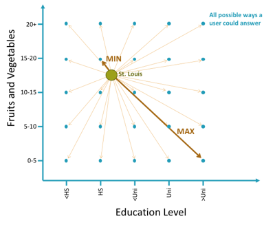
In two dimensions, remember that the distance between two points on a plane is the square root of how far apart they are on the x-axis, squared, plus how far apart they are on the y-axis, squared. That is, it’s the hypotenuse of a right triangle built around those two points as in the picture below.

Luckily, this same calculation holds as we expand from just two dimensions into any number more. In the five dimensions of our five categories of social determinants of health, the equation expands out to the square root of the sum the squares of how far an MSA is from a particular set of answers.
The Inverse of Distance is Similarity
Two things with a shorter distance between them are considered to be more similar, and if we compute all the distances between every set of possible responses and all of the locations we have, then we know how absolutely similar and how absolutely far answers and locations can be from one another.
Another scaling activity using those min and max distances makes the data more interpretable to us in the form of similarity. A 100% match with a location means that you’ve answered the questions in such a way that you couldn’t get any closer than that. A 0% match means you’re as far away as possible from that location—at least in terms of your social determinants of health characteristics.

Making it Interactive
Our design team did a great job making a user’s interaction with the infographic fun and informative. What do you want to know as you start answering our questions about your voting history and eating habits: Which locations are the closest fit for people like me? How close a match am I to where I actually live? How close a match am I to some other place I’m interested in? What are the social determinants of health in this place of interest compared the overall population? All of that information is immediately available and easy to see at a single glance.
What Difference Does it Make?
Other than having a fun interactive experience, what does this mean for you? What are you supposed to do with the information? My recommendation is that your share it on your social media feeds to help other people be more aware of the importance of social determinants of health and the strong impact they have on health outcomes.
If you care about the health outcomes of others and the overall health of the population at large, think about what those categories and questions actually represent. In order to improve health outcomes, we’ll need services from multiple public and private channels that enhance access to parks, promote the importance of education, provide fresh food to eat, encourage voting and other forms of civic participation, and provide access to affordable health insurance and services. All the predictive analytics and data science in the world won’t make a difference if there isn’t any response to what it is telling us.

Have any questions or want to know more? We have answers.